Entertainment on the biggest screen at home!

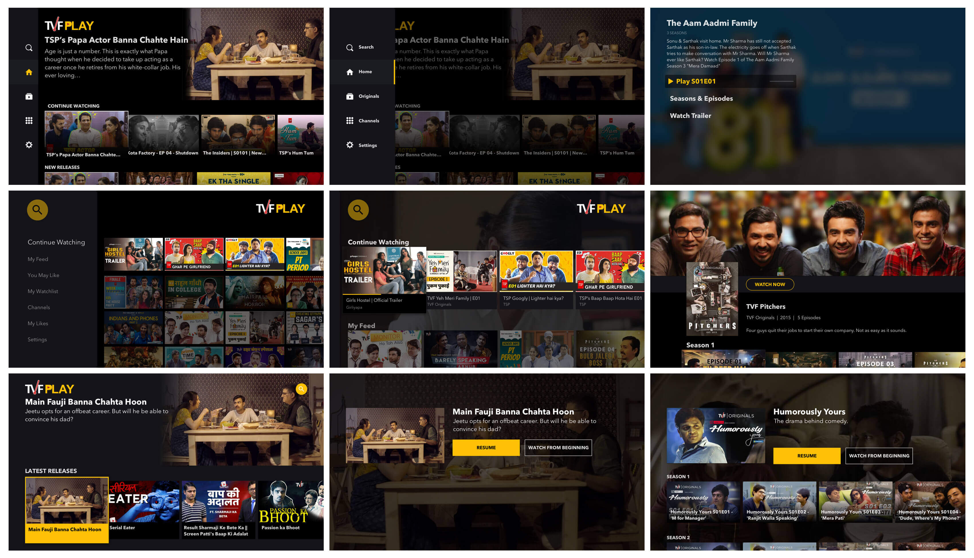
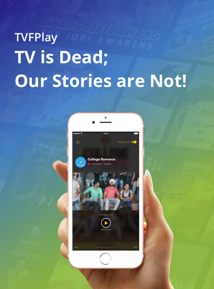
TVF produced clean family content that user's could consume with the whole family on the biggest screen at home. TV was an obvious low hanging fruit to get more user's hooked on to the platform.

My Role
Platforms
Year

Problem

As Chromecast & FireTV devices became popular in India, there was a need for the TVFPlay app to scale up to TV. Designing for TV is a paradigm shift from designing for smaller screens. Each week, we receieved a number of user requests for the Android TV & FireTV app. The international market demanded for the Apple TV app.

Design Thinking

Big and beautiful content is the center of the TV interface. Content appears cinematic, with elegant transitions, and minimal text. The TV screen favors low-density, curated, actionable content, and categories.

Cinematic experience

The large screen affords the opportunity for large, high-resolution graphics and visual elements that build a rich and dynamic experience. During transitions and feedback operations, use movement to bring actions to life.

Simple navigation

TV should provide the shortest possible path to content. New content should be easy to discover. There should be a reduced number of choices to make on content and settings screens. The default action should be one click away.

Lightweight interaction

Aim for least amount of friction. Minimize the number of navigation steps required to perform actions with the fewest screens possible between app entry and content immersion.

TV Design Ideas

Creating Design System

A Design System was built to accommodate scalibility, so components can work well alongside each other, at the same time, render well on various device resolutions.

Dark color scheme

I intentionally chose a dark theme for the app since our users tend to engage in the app much later in the day, and in a room with dimmed lights, and thus a brighter theme would have been too harsh on the eyes.

Sketch symbols

I started by building a comprehensive components library within Sketch that would later reflect in various parts of the app, i.e., colors, typography, setting the grid etc. This included icons, buttons, form elements, error and empty states, show cards and content cards. For achieving vertical rhythm, I used an 8pt grid system (fonts set at 4pt, UI set at 8pt).

design-system design-system design-system design-system design-system design-system design-system design-system design-system design-system

But wait, there is more

project
project
project
project
project
project